Welcome to Team SARS’ final ADAmazing project. In this study, we explore the intricate relationship between voting intentions and media coverage in the past three US presidential elections. We present several analyses that may (or may not) determine an existing correlation between media coverage of a presidential candidate and their respective voting intentions in the months preceding the elections. Hop in, buckle up and enjoy!
Table of contents
Background
It is often argued that former US president Donald Trump’s upset victory in the 2016 elections strongly relates to his ability to monopolize the attention of mass media outlets [1]. Although the former president’s polemical nature granted him a front row seat at almost every (inter)national news outlet in the months and years preceding the election [2], it can be a difficult task to assess the impact that such incessant media coverage had on the final outcome of the presidential elections. This is precisely the question that we aim to answer in the following study. We use the Quotebank [3] quotations corpus to analyze possible correlations and causations between the media coverage of three different major outlets with notoriously distinct political inclinations: CNN (democrat), BBC (centrist) and Fox News (republican) as well as voting intentions in the months preceding each elections.
A Visual Tour of Media Coverage & Voting Intentions
One of the first question that we were faced with related to finding accurate means of quantifying media coverage and voting intentions. As such, we define the following:
-
Media Coverage: defined in our study by the number of occurrences of keywords (such as a presidential candidate’s name or his/her running mate) during a given presidential election in a given newspaper (BBC, NY Times or Fox News).
-
Voting Intentions: defined in our study by poll numbers for each presidential candidate in the months prior to a given election.
In this section, we present a visual description of the data parsing and manipulations performed in order to begin our study.
Media Coverage
Retrieving media coverage was done solely through the Quotebank dataset [3]. We started by gathering all the quotations for the years in which a presidential election occurred (2012, 2016 and 2020), originating from one of the following three newspapers: NYTimes, Fox News, BBC (done by checking the origin of each link in the dataset’s URL column).
For each of the parsed quotation, we kept only those that included at least one occurrence of the presidential candidates names (or their running mates) within the quotation, the speaker or the URL attributes of the dataset. Finally, we built timelines of the retrieved occurrence for each of the three aforementioned newspapers in the months preceding the presidential elections (January - November) in 2012, 2016 and 2020.
We start by presenting a visualization regarding the number of mentions per month for each newspaper that we have retrieved when parsing the data. This part does not focus on the candidates but rather on the overall occurrences of any keyword of interest per newspaper.
This initial visualization gives us several important insights for our study:
-
First: the data for the 2012 elections that we retrieved is fairly well represented with generally more mentions in the NY Times, somewhat closely followed by Fox News and finally by BBC which (as expected) has the least mentions- we believe that BBC should have the least mentions because it isn’t a natively American newspaper and since it is generally regarded as more “centrist” leaning - in contrast to NY Times that is typically democrat leaning while Fox News being republican leaning.
-
Second: we are missing a considerable amount of data for the months of January-June, October 2016 and May-November 2020. This could potentially mean that there are only very few mentions in the newspapers we target (which seems highly unlikely considering the general fuss in the months leading to the elections and by comparing it with the 2012 data retrieved). A more plausible explanation refers to the quality of the Quotebank dataset, simply missing relevant quotations in these months. Concerning 2020, we noted that the Quotebank data retrieval ended in April 2020 [3], which confirms our observation. Concerning the 2016, we note in the visualization below that the missing data is simply caused by the poor nature of the dataset.
We illustrate in the bubble chart above the total number of quotations present in the Quotebank dataset for a given newspaper in a given month (indicated by the larger transparent bubbles) versus the number of quotations retrieved that include any of our keywords of interest (presidential candidate name or running mate name) for a given newspaper in a given month. We distinctly note that the Quotebank dataset exhibits very few total quotations for any of the newspapers in the months of January to June (inclusive) and October. This behavior was however already noted by Vaucher et al. [3], as a clear drop in quotation counts over time between 2015 and 2017 is visible on Figure 4(c) on page 8 of the “Quotebank: A Corpus of Quotations from a Decade of News” paper.
At this point, we made a important decision regarding the missing data for the years of 2016 and 2020. Since we are missing a considerable amount of data for the majority of the months in 2016, we decide to base the rest of our correlation study only on the months of July, August and September (for which we deemed to have enough data - yes, this decision is purely arbitrary and visual, it unfortunately does rely on any die-hard statistical study performed by us). Similarly for 2020, we decide to retain only on the months of January to April (since we do not have any quotations for the subsequent months). An alternative to dealing with the missing data would have been to scrape additional quotations from BBC, NY Times and Fox News for all the problematic months. However, such an option was infeasible considering the time frame in which we conducted this study.
We then proceed in our analysis by visualizing the distribution of mentions per candidate retrieved for the three years of interest (independently of the newspaper in which the mention occurred). We see in the visualization below a very interesting trend in which the republican candidates are generally more represented/mentioned in the three elections (without distinguishing between newspapers). Although the difference between Obama and Romney remains somewhat limited, the few months we can observe in the 2016 and 2020 elections show a complete disproportion in coverage between Trump and the democratic candidate.
It is also interesting to note the overall difference between the republican and the democratic candidate over the span of the three elections. In 2012, we found 2695 more quotation referring to the republican candidate (Mitt Romney) than the democratic candidate (Barack Obama). This number is then increased almost two-fold (5460 quotations in 2016 and 4245 quotations in 2020) for the 2016 and 2020 elections. Even considering all the missing data in our set for 2016 and 2020, this is a notable difference that may be even more drastic with a full dataset. Such an observation may raise the question on whether the arrival of Donald Trump as a presidential candidate motivated an increase in media coverage difference between republican and democratic candidate.
We can further delve into the difference in coverage between republican and democratic candidates by visualizing the distribution of quotations referring to each candidate on a newspaper basis.
We see that tendency previously mentioned to predominantly cover a republican candidate is not necessarily true for 2012: although NYTimes (a notoriously Democrat newspaper) shows stronger media coverage for Mitt Romney, we note that Fox News (a notoriously Republican newspaper) shows slightly higher media coverage for Barack Obama. This is a very interesting behavior that is not apparent when looking only at overall mentions across all newspapers.
The only month in 2012 in which Barack Obama was given more NYTimes media coverage was in May. We also see that the highest democratic candidate coverage in the Fox News newspaper was during that same month. Can these peaks be attributed to a particular event? After a quick online search we found that in May 2012, Barack Obama became the first sitting US president to announce support for same-sex marriage [4]. Could these events be related? A more fined grain analysis may reveal correlation between these two observations.
Nevertheless, for the data we have in 2016 and 2020, Donald Trump always seems to get more media coverage than his democratic opponent.
Voting Intentions
In order to quantify the change of public opinion during the election period, we base our analysis on a total of 263 national surveys conducted by different agencies (an average of 2.7 surveys per day), in which the forecaster of vote of each candidate was measured in a gap of a few days (around 3-5 days). We retrieved the data of interest (which shows the result of different pollsters and their respective dates of execution) using a self-built python web-scraper that gathers poling numbers from the well-known Real Clear Politics website: Polls 2020, Polls 2016, Polls 2012. All national surveys that are presented in this work used a demographic balanced sample.
the figure above displays the time series of potential percentage of votes for each candidate. Each point in the time series corresponds to a particular date, but its value is the average of polls aggregated per week. In other words, a 7-days sliding window average was used and in consequence each point in the time series takes into account an average of 19 polls.
We note in the figure that during the 2016 elections, democratic candidate Hillary Clinton kept up an advantage over her opponent Donald Trump during the entire presented time period. However, we do observe that clear drops in voting intentions for the months of April, May, July, August and October for Hillary Clinton. If we inspect the individual series, we can see that the initial advantage decrease of Hillary Clinton is almost inversely proportional to the gradual ascend of Trump’s popularity until October. It is also very interesting to analyze such time series in retrospect, i.e after knowing the outcome of the elections. Simply from the presented 2016 time series, we see a rather obvious distinction between the presented poll numbers and the final outcome of the election, i.e Hillary Clinton is continually leading in the polls, yet ended up loosing the race for Presidency. Nevertheless, the overall trends of candidate popularity in the months preceding the elections do show a steady decrease for candidate Hillary Clinton and a steady increase for candidate Donald Trump.
Now that we have conducted a visual and descriptive tour of the data we will use for our analysis, we would like to take you through an exploration on how mass media may have contributed to the formation of the observed fluctuations in voting intentions. We will try to infer if and how the mass media can influence in the vote of the citizens.
Getting Our Hands Dirty
Our journey in the land of correlations will be divided in two main parts. First, we develop a baseline model in which we simply compare media coverage and voting intentions. To do so, we use specific statistical tests suited for the distribution of our gathered data and try to interpret the statistically significant retrieved results. Since this first study may involve unknown covariates and biased results, we decide to expand our work by including a notion of sentiment to each quotation. A sentiment score will then be taken into account when performing the correlation study, hopefully leading to more interpretable results.
Baseline Correlation Study Between Media Coverage & Voting intentions
Our goal is to discover if there is a relationship between the media coverage and voting intentions. As such, it is important to prepare and modulate our data in a way that will be beneficial for our baseline study. We therefore start our work by describing the preprocessing made on the quotations followed by the analysis performed. We then finalize it by presenting the correlation scores (and their statistical significance) retrieved for each candidate, in each newspaper, on a yearly basis.
Preprocessing & Analysis
One of the most important aspect of the preprocessing done to our data is the metric on which we decide to aggregate it. Choosing a suitable enough method will allow us to summarize the essentials of the quotations without loosing valuable information through aggregation. For instance, if we decide to aggregate our quotations by year, we will only have 1 data point. Aggregating the quotations by months will give us 11 data points for 2012, 3 for 2016 and 4 for 2020. Clearly, these two options would not provide us with meaningful insights on correlations between media coverage and voting intentions due to the lack of data points caused by the aggregation. As such, we opt for a more fine-grained approach: aggregating the quotations and voting intentions by week. More precisely, the aggregation of voting intentions is performed as follows: for each candidate in a given election year we take the mean of intention votes over the week. As for the media coverage, we note that just summing the quotations occurrences for each week is not a realistic measure of how important those occurrences were. This is due to the fact that the quotations in the Quotebank dataset are not uniformly distributed over the weeks. Thus, we purposefully re-scale each sum of occurrences by dividing it with the total number of quotations during that same week.
As a second step in our correlation study set up, we determine which statistical test might be the most appropriate to use based on the distribution of our data. As such, we start by using a normality test to determine if our data follows a Gaussian distribution. If it does, we may be able to the Pearson correlation test since under such a condition of normality we can get an unbiased estimator as the error terms are normally distributed, and so the test of significance of Pearson’s correlation coefficient may give wrong results.[5] On the other hand, if our data does not follow a normal distribution, we may use the Spearman’s Rank correlation test as it is regarded as a more general and flexible (less assumptions) measure which can capture the monotonic relationship between our two variables of interest. [6]
To test the whether the data was drawn from a normal distribution we apply the Shapiro-Wilk test [7] to our weekly occurrences of quotations rescaled, and to the voting intentions’ weekly means variables retrieved for each (candidate, year, newspaper) combination. The Shapiro-Wilk test is one of the most popular and powerful method to detect non-normality. We present below a table of the Shapiro-Wilk test results retrieved for each (candidate, year, newspaper) combination.
| Year | Candidate | Newspaper | O.N. P-value | I.N. P-value | |
|---|---|---|---|---|---|
| 0 | 2012 | Obama | BBC | 0.000002 | 0.943012 |
| 1 | 2012 | Obama | Fox News | 0.338060 | 0.943012 |
| 2 | 2012 | Obama | NY Times | 0.000098 | 0.943012 |
| 3 | 2012 | Romney | BBC | 0.002176 | 0.021756 |
| 4 | 2012 | Romney | Fox News | 0.002341 | 0.021756 |
| 5 | 2012 | Romney | NY Times | 0.000704 | 0.021756 |
| 6 | 2016 | Clinton | BBC | 0.216067 | 0.113037 |
| 7 | 2016 | Clinton | Fox News | 0.924074 | 0.113037 |
| 8 | 2016 | Clinton | NY Times | 0.033021 | 0.113037 |
| 9 | 2016 | Trump | BBC | 0.725930 | 0.993658 |
| 10 | 2016 | Trump | Fox News | 0.962056 | 0.993658 |
| 11 | 2016 | Trump | NY Times | 0.071965 | 0.993658 |
| 12 | 2020 | Biden | BBC | 0.019856 | 0.099852 |
| 13 | 2020 | Biden | Fox News | 0.000841 | 0.099852 |
| 14 | 2020 | Biden | NY Times | 0.159071 | 0.099852 |
| 15 | 2020 | Trump | BBC | 0.887226 | 0.990791 |
| 16 | 2020 | Trump | Fox News | 0.514097 | 0.990791 |
| 17 | 2020 | Trump | NY Times | 0.111136 | 0.990791 |
In interpret this table as follows: if the p-value returned by the test is smaller than 0.05, then the null hypothesis that the data is normally distributed can be rejected. We note that for about 11 out of 36 of our combinations, the p-values returned for the intention normality test (I.N.) or for the occurrences normality test (O.N.) are smaller than 0.05. Indeed, we distinguish two cases: first if at least one of the two distributions (I.N. or O.N.) is not normally distributed the result of Pearson’s correlation coefficient study may be wrong (due to non-normality of our data). Second, if the two variables show high p-value, this may be an indication that our two datasets are normally distributed. Nevertheless, since there is a rather high number of combinations presenting non-normality, we decide to conduct our correlation study using Spearman’s Rank correlation coefficient. An additional argument for not using the Pearson’s correlation test is the fact that our data does not seem to present linear relationships (this was determined after visualizing the relationship of media coverage and voting intention for each of the aforementioned combination). As such, we believe that having a correlation test that measures the monotonic relationship between our two variable of interest is a more suitable metric for our study.
Correlation Results
We note that in the Spearman’s Rank correlation study performed, the null hypothesis of this test is that there is no correlation between media coverage and voting intentions. We present in the illustration above three categories: statistical tests in which we have clear significance where p<0.05, i.e the null hypothesis can be rejected (marked in dark blue), statistical tests in which we observed “weak significance” where p is between 0.05 and 0.1, i.e the null hypothesis may be rejected (marked in light blue) and finally statistical tests that do not present any significance, where p>0.1, i.e the null hypothesis cannot be rejected (marked in red).
We note a few interesting observations:
- Barack Obama: We note that Fox News, BBC and NY Times exhibit a negative correlation between the media coverage and voting intentions, but these result are not statistically significant thus cannot be considered for our study (the p-values retrieved for the three newspapers are all higher than 0.1).
- Mitt Romney: the three newspapers exhibit positive correlations between media coverage and voting intentions. We note that for the NY Times and Fox News newspaper, the correlation study is supported by a small p-value (thus the null hypothesis previously described can be rejected), which in turn can be a strong indication that there may exist a positive correlation between media coverage in voting intention. A similar argument can be drawn for the BBC newspaper, but this time we only note a weak indication of correlation (as the p-value is between 0.05 and 0.1).
Thus, concerning the overall 2012 elections, we may observe a correlation between media coverage and voting intentions for candidate Romney. However, nothing can be concluded for candidate Obama. - Hillary Clinton: we note overall positive correlations for the three newspapers. However, only the correlation exhibited by the BBC newspaper can be considered since it is the only test in which we have statistical significance (the p-value is smaller than 0.05).
- Donald Trump 2016: we observe positive correlations in all three newspapers. Nonetheless, in a similar manner as Donald Trump’s opponent candidate Hillary Clinton, we only witness statistical significance for the BBC newspaper.
- Joe Biden: although we note only positive correlations between media coverage and voting intentions in the three newspapers, no conclusion can be draw as all correlations exhibit a p-value higher than the 0.1 threshold. The null hypothesis cannot be rejected.
- Donald Trump 2020: The study conducted for candidate Donald Trump in 2020 exhibits a similar behavior as the one done for his opponent Joe Biden. We note positive correlations for BBC and Fox News and a negative correlation for NY Times. However, since the p-values are all higher than our threshold, we cannot reject the null hypothesis.
This first baseline correlation study illustrates a few interesting behaviors. First, it is intriguing to note that the BBC newspaper in 2016 seems to exhibit an overall positive correlation between media coverage and voting intentions for both candidates (Hillary Clinton and Donald Trump 2016) - both with a fairly similar spearman coefficient. We believe that such an observation highlights the “centrist” nature of the newspaper, noting here that in a newspaper such as BBC, any mention of a candidate may incur an increase in voting intentions. However, it is also important to highlight that in our original dataset, we have significantly less quotations originating from the BBC newspaper than from NY Times or Fox News. Considering the fact that we barely note any statistical significance for the correlation study of the latter two newspapers, it is possible that this discrepancy in overall quotations may have an effect on the study. However, it is difficult to determine the significance of such a possible impact (if any). Ideally, the study would be conducted with an equal and sufficient number of quotations originating from each newspaper. Alternatively, another inquiry that may arise from these observations, may question the reason behind the fact that we do not observe statistical significance for all the candidates in the BBC newspaper.
A second interesting observation relates to the results retrieved in the three newspapers concerning candidate Mitt Romney. As previously mentioned, we note that any coverage could potentially causes a raise in voting intentions. Such a relationship may make sense in the case of a republican newspaper (possibly a centrist one as well), since Mitt Romney is himself a Republican candidate. However, how could we explain the statistically significant correlation observed in NY Times for Mitt Romney? Would it make sense for a notoriously Democratic Newspaper to have a positive effect on the voting intentions of a Republican candidate? It is difficult to answer such a question without taking into account the context in which the quotations were made, specifically regarding the overall sentiment of the quotations.
As such, we decide to expand our correlation study by including a sentiment analysis performed on each of the retrieved quotations. We note that drawing any conclusions from the results retrieved in the first baseline correlation study may be an arduous task since there may be external covariates that we do not take into account influencing the results observed. One such covariate may be the sentiment of the quotations. If we can, for instance, determine that most of the quotations retrieved for the NY Times newspaper about Mitt Romney have a positive connotation, we may explain why the observed correlation between media coverage and voting intentions is positive (although it would give us no insight as to why a Democratic-leaning newspaper would include positive connotations about a Republican candidate).
Additionally, simply studying the baseline correlation between candidates Hillary Clinton and Donald Trump in 2016 gives us little information regarding the nature of the potential correlation. Indeed, we would interpret our results in complete different manners if we note that the positive correlation between media coverage and voting intention is caused principally by quotations deemed negative versus if it is caused mostly by quotations deemed positive.
Consequently, we present in the next section the sentiment analysis conducted on our datasets and the results achieved, with some possible interpretations of the observations witnessed.
Correlation Study with Sentiment Analysis
Up until now, we have only considered a candidate’s quotations with the same weights, i.e we did not take into account any contextual or semantic background intrinsic to a quotation. However, we argue that several quotes concerning a specific candidate may have very different implications on our study based on their positive or negative connotation. Therefore, we expand our analysis with an additional dimension: sentiment polarity.
As such (and for time/practicality purposes), we assume the following properties:
- Sentiment Correctness: We assume that the aggregated sentiment of the quote reflects the general sentiment toward the candidate i.e there is a negligible amount of hypocrite, ironic or humorous quotes.
- No External Bias: We assume that QuoteBank is a non-biased sample of media coverage. This would indeed be the case if QuoteBank was a complete set of all words used in a newspaper for the last 15 years, which is not clearly not practical. QuoteBank is biased but we assume for the sake of our analysis that its biased nature does not interfere in our study.
Furthermore, it is important to note that we decided to conduct an unsupervised sentiment analysis (in contrast to a supervised one, in which an external labeled dataset may have been necessary). This set up unfortunately makes it difficult to precisely assess the accuracy of our model.
Preprocessing & Model Implementation
Our model takes as input a text sample (i.e the actual QuoteBank quotation of interest) and output the sentiment associated to it - a floating point value between -1 and +1 where the former refers to the most negative possible sentiment and the latter to the most positive one.
We additionally applied a simple preprocessing pipeline to prepare quotes for the sentiment analysis. We start the pipeline by removing the “noise” in the data - referred here as the characters in the quotation that do not directly relate to human textual language. These include elements such as special characters, parentheses, square brackets, white spaces, URL’s and punctuations. As a second step, we perform text normalization by tokenizing the quotations. To do so, we use the tokenizer class from the python NLTK library. Finally, we lower case each word of the dataset, convert each number to their word representation, perform contraction replacement and conclude with stemming and lemmatization of the tokens.
Pipeline
- Remove punctuation
- Make text lowercase
- Tokenization
- Remove stopwords
- Stemming
- Lemmatization
Example
- Original quote: Trump’s a tough guy to vote for.
- Preprocessed quote: trump tough guy vote.
Concerning the model used, we decided to experiment with three different unsupervised models
- VADER (Valence Aware Dictionary and sEntiment Reasoner) is a lexicon and rule-based sentiment analysis tool that is specifically attuned to sentiments expressed in social media. It predicts the sentiment of the quote as a float, positive values are positive valence, negative value are negative valence.
- Pre-trained BERT with >700 embeddings (bert-base-multilingual-uncased-sentiment). This transformer-based model predicts the sentiment of the review as a number of stars (between 1 and 5).
- TextBlob. This model aims at providing access to common text-processing operations. The polarity score is a float within the range [-1.0, 1.0]. The subjectivity is a float within the range [0.0, 1.0] where 0.0 is highly objective while 1.0 is highly subjective.
Sentiment Analysis
The model selection was done using vizualisation tools such as barplots and word-clouds (see Figures below). All further plots were done with the best model retrieved in our analysis (TextBlob). This model provided the following interesting properties:
- An additional interesting metric by default: subjectivity.
- The ‘default’ return value is a polarity score of 0 (neutral) which is of particular interest to our study and easy to interpret. Note that such a return neutral score is not by the other models. For instance, BERT outputs a majority of 1-labeled quotes (highly negative labeled quotations) by default which would introduce inaccuracies in our dataset.
- Since we aggregate the data by (months/weeks) for the correlation study, we prefer numerical data indicating sentiment scores rather than categorical ones. This hopefully offers a more wide range of sentiments/emotions.
A typical processing and regression pipeline on a single quote would be the following:
- Original quote : Trump’s a tough guy to vote for.
- Preprocessed quote : trump tough guy vote.
- Polarity/subjectivity score : [-0.389, 0.834].
As an interesting visualization for the results retrieved from our sentiment analysis performed with TextBlob, we present below six word clouds illustrations of the most frequently occurring positive and negative words in each year.
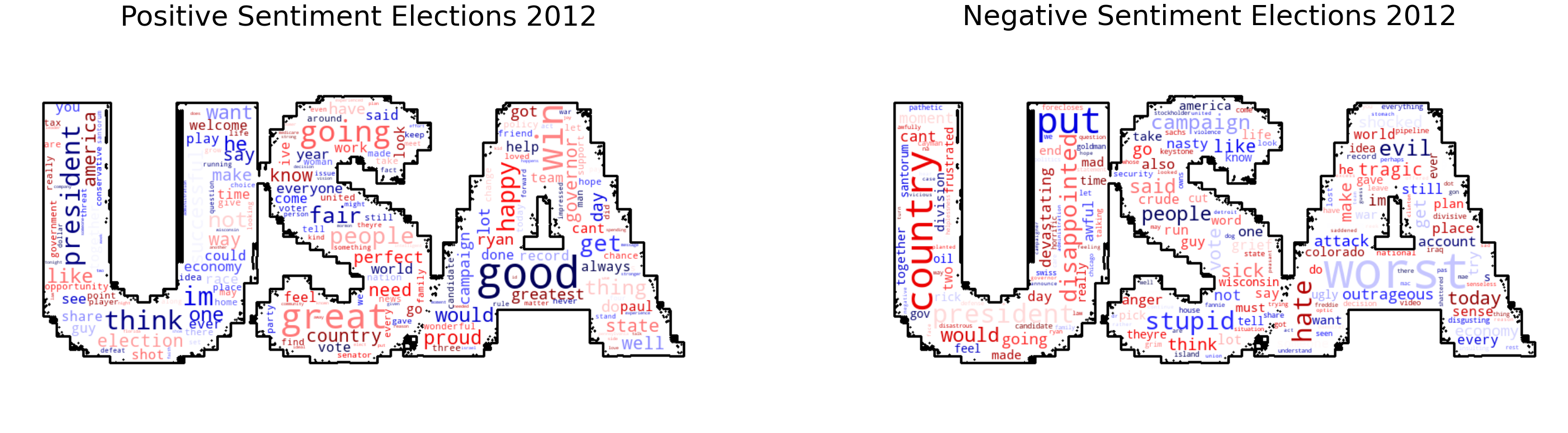
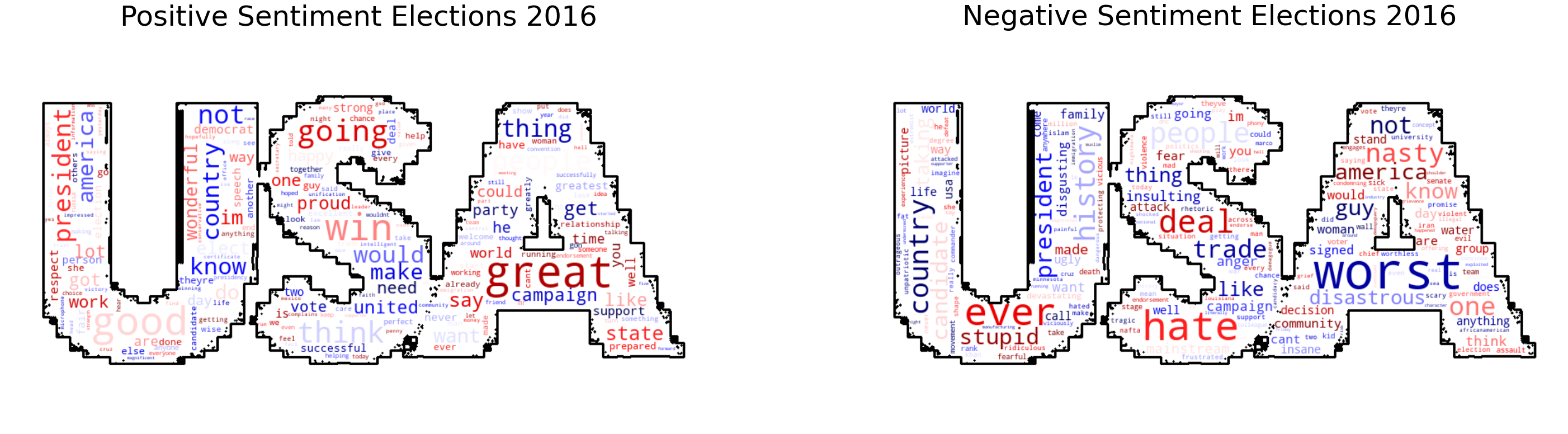
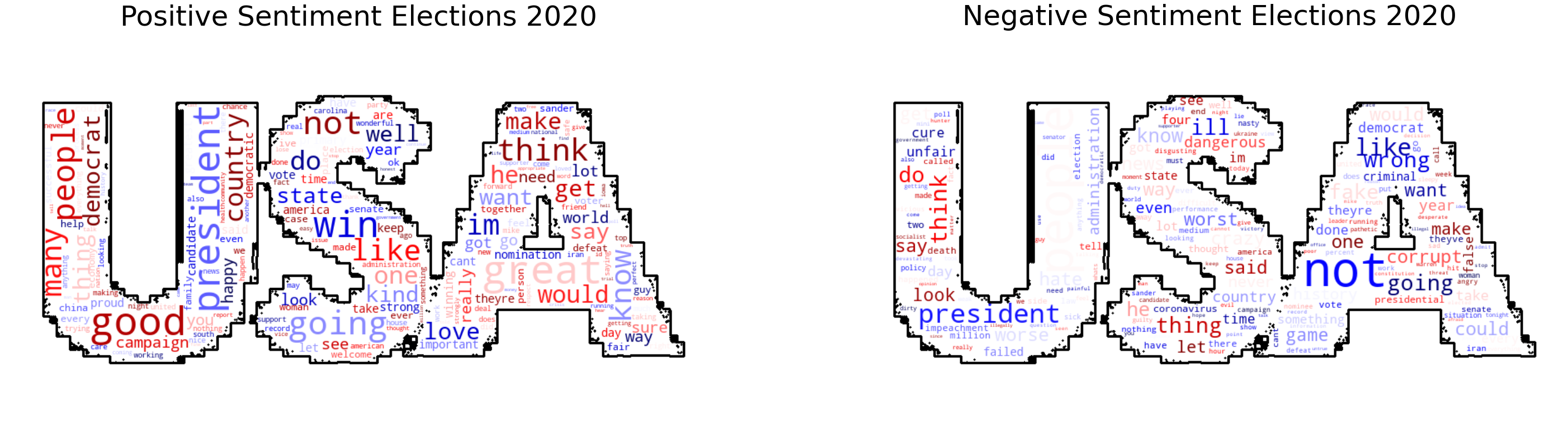
We can intuitively assess the precision of our model by looking at word clouds. We classify quotes with strong negative polarity valence (< -0.8) as negative and strong positive polarity valence (> 0.8) as positive quotes. This method allows us to filter all quotes with low-confidence or low polarity values. We observe a majority of great, good, win words for positive quotes and worst, hate words for negative quotes.
To further develop our sentiment analysis, we also compare vote intentions with aggregated polarity of quotes on a candidate/monthly basis. Plotting the polarity and subjectivity distributions over time gives us the following results.
We can note from the two plots above a few interesting observations. First, most of the quotes are labeled as neutral which centers heavily the data around 0. Secondly, there is a noticeable increase in polarity (2-factor) in the last month of 2012 (November) just prior to elections without a noticeable change in subjectivity. This could mean all newspapers focus on promoting their favorite candidate rather than writing about the opposing one. Unfortunately, the change in polarity (y-axis) from a month to another is (in most cases) very small. On average, the rate of change of polarity score is 100x smaller than the corresponding standard deviation. To illustrate, we compute the average standard deviation of polarity score over the whole year : \(p_{std}^{2012} = 0.247\), \(p_{std}^{2016} = 0.235\) & \(p_{std}^{2020} = 0.253\). This makes it difficult to compare and draw a meaningful statistical conclusion and indicates the need for more data points. A similar effect can be noticed with subjectivity scores: \(s_{std}^{2012} = 0.3155\), \(s_{std}^{2016} = 0.2956\), \(s_{std}^{2020} = 0.3098\). Finally, we observe a very different timeline for the 2016 election due to missing data and quotes from 2020 don’t extending past April. This is explained by the missing data in media coverage.
As the aforementioned results show, candidate mentions and polarity values on their own are not sufficient to explain shifts in voting intentions. As such, we decide to combine these results in a new, more fine-grained correlation study. To do so, we repeat the Spearman correlation tests as previously done in the baseline study, this time partitioning the datasets for each candidate based on polarity (>0 positive and <0 negative). Finally, we highlight the fact that we do not take into account the quotes with neutral polarity, which is the overwhelming majority and contributes to the issues explained above. This decision was made on the assumptions that neutral quotes might be the result of a model error or over-preprocessing of the quote. And that any statistically significant correlation between neutral quotes and voting intentions might be hard to interpret.
Correlation Results
We illustrate the results of the correlation study with sentiment analysis below.
We note the following interesting observations:
- The correlation results for Romney in both NY Times and in Fox News indicate a statistically significant positive effect on voting intention. It is interesting to note that in this case, the sentiment analysis does not seem to alter the results of the correlation. This could be a perfect case of “all publicity is good publicity” as we note that both positive as well as negative quotations seem to have a positive effect on the media coverage. To this we also observe a weak statistical significance for the positive quotations retrieved from the BBC newspaper (which mimics the results found in the baseline study for candidate Mitt Romney in the BBC newspaper)
- The sentiment analysis performed on candidates Donald Trump and Hillary Clinton in 2012 in the BBC quotations provide stronger evidence that only the positive quotations could have contributed positively to either candidate’s voting intention values. In the baseline correlation study we previously performed, we mentioned the difficulty behind explaining the observed result of statistically significant positive correlation between media coverage and voting intention for both candidate. Including a sentiment analysis in this case allowed us to determine that it was in effect only the positive quotations that may have contributed to this observed behavior (since the negative quotations for either candidate are not statistically significant - high p-value). Such a behavior seems rational as one would naturally believe that any positively annotated mention in a well-known newspaper such as BBC may have a positive effect on voting intention. It would have been more baffling to witness the opposite behavior: negative quotations affecting the voting intentions positively.
- Including sentiment analysis in our correlation study also allowed us to note a final very interesting observation previously not visible in the baseline study: a weak evidence that there may be a negative correlation between media coverage and voting intention in BBC is now visible for candidate Joe Biden. This is a fascinating result to observe as it clearly shows the benefit of including a sentiment analysis in such a study. The observed result would make sense in a rational manner: negative mentions about Joe Biden in a newspaper such as BBC may negatively affect his voting intentions.
Bonus: Because we still have something up our sleeve
As we have seen in the previous sections, it can be a very difficult task to accurately interpret some of the observed results of our correlation analyses. Since neither of the studies provided us with strong insights on the relationship between media coverage and voting intention, we decided to expand our set up a little bit. This is the reason why we decide to present this bonus section, in which we’ll describe another way, more specifically a Topic Modeling way, through which the correlation studies described above can be conducted. To do so, we start by clustering the Quotations in six topics or related groups of news by using LDA topic modeling. The reason behind factorizing the corpus in six topics is based on the fact that we have a low-dimensional representation of the corpus and a clear interpretation of the topics due to our prior political background knowledge. We found that this factorization allowed us to draw useful conclusions on some of the topics retrieved. However, more sophisticated methodologies to estimate the most efficient number of topics in a corpus can be taken into account in future research.
Topic modeling results
We present here a topic modeling study performed only on the quotations retrieved from the Fox News newspaper. We limit our study to just one newspaper for timing reasons. Further studies may expand this study to the remaining newspapers and subsequently apply the results retrieved to the correlation studies previously performed. After pre-processing all our FOX News quotations, we apply LDA. By using the PyLDAvis library, we build the visualization presented below:
Clustering FOX News quotations
We note a few several interesting observations. For instance, the first retrieved topic most likely concerns elections in general sense and is represented by words such as campaign, election, candidate, etc. This result is consistent with the fact that we analyze political news during the campaign period. However, we decide to discard this topic due to its lack of specificity. The remaining topics are, however, very informative and reveal the subjects discussed during the electoral campaign. Examples include:
-
Clinton email controversy: Covering the famous controversy Hillary Clinton faced during the elections she used her private email server for official communication.
-
Immigration: Relating to the fortified wall to be built between Mexico and USA, proposed by Donald Trump.
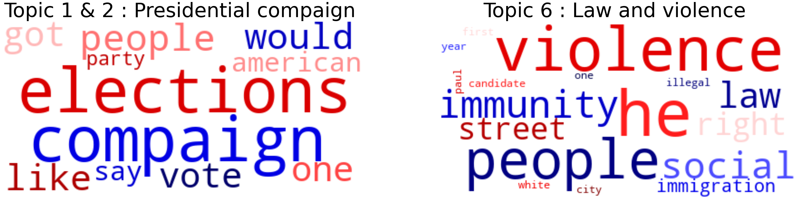
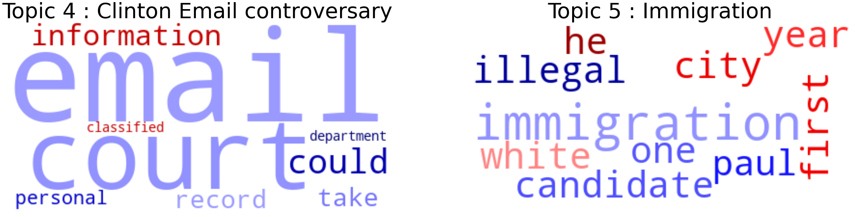
The keywords which define these 2 topics are represented in the wordclouds above. After assigning the topics and their weights to each of the quotes, we’ve plotted the time series for FOX News coverage in 2016:
We can now use these time series constructed and presented above to calculate the Spearman Rank correlations between media coverage of Fox News and voting intentions for our two candidates in 2016. This would most likely give us different insights on our work presented in the previous sections of the data story (in the baseline and sentiment analysis). We note that another interesting approach could be to run a regression analysis using sentiment analysis and topic_weight as covariates. Unfortunately, due to serious time constraints, we limit this section as a mere taste to what further research may focus on if they desire to expand the study we presented in this story.
So, summing up our ADAstonishing results
In our work, we have performed a thorough analysis that aims at discovering a potential correlation between media coverage of three major newspaper outlets (BBC, NY Times and Fox News) and voting intentions for the past three presidential elections. After efficiently and meticulously retrieving and aggregating the data that we use for media coverage and voting intentions, we perform two correlation analysis: one based only on the differences noticed in distributions of media coverage and voting intentions, the other, more specific, in which we add a dimension of sentimentality to the analysis.
We are happy to see that the results of our initial study do show a some statistical significance for a few newspapers and candidates (such as BBC and candidates Donald Trump and Hillary Clinton in 2016) which may be an indicator of a correlation between media coverage and voting intentions. Additionally, the results of our correlation study conducted with sentiment analysis give us a more detailed indicator of which types of quotations may have an positive or negative impact on the voting intentions (e.g Hillary Clinton and Donald Trump in BBC in 2016 and Joe Biden in BBC in 2020). Nevertheless, we note that our results are hard to interpret and do not provide the full insight into a potential correlation and/or causality between media coverage and voting intentions. The majority of the results observed in our two correlation studies exhibit high p-values, thus giving us no further information regarding potential conclusions to draw.
We believe that the nature of the Quotebank dataset (i.e biased quotations and missing data), may have had a significant negative impact on our study. Ideally, we would re-conduct this study on a balanced, unbiased dataset (especially important for the sentiment analysis) with sufficient data points (quotations), equally divided among the months of each year of interest. We highlight the fact that the Quotebank dataset is not an accurate representation of media coverage.
We added as a final section, an expansion of our correlation analysis via topic modeling. Such a model may be a good approach to include different insightful results not previously visible in the two correlation studies performed above.
All in all, considering the nature of the data on which the study was performed, we believe that a few insightful tools have been developed and subsequently interesting results retrieved, which could in turn motivate for further research on the intrinsic relationship between media coverage and voting intentions.
Thank you very much for this semester’s great ADAventure, we hope you have enjoyed our data story as much as we have enjoyed creating it.
Team SARS
References
[1] https://www.politico.com/magazine/story/2016/11/2016-election-trump-media-takeover-coverage-214419/
[2] https://www.bbc.co.uk/news/36429660.amp
[3] https://dl.acm.org/doi/10.1145/3437963.3441760
[4] https://obamawhitehouse.archives.gov/blog/2012/05/10/obama-supports-same-sex-marriage
[5] https://www.researchgate.net/post/Which-correlation-coefficient-is-better-to-use-Spearman-or-Pearson
[6] https://en.wikipedia.org/wiki/Spearman’s_rank_correlation_coefficient
[7] https://en.wikipedia.org/wiki/Shapiro%E2%80%93Wilk_test